


Brand relaunch for manufacturing specialist, Fablink
Fablink Group, a tier one manufacturer supplying steel and aluminium products to global OEMs including CAT, DAF, Jaguar Land Rover and JCB, today announces the official launch of its new branding, with a refreshed logo that reflects the brand’s growth intentions within a fiercely competitive manufacturing industry. The unveiling follows the website relaunch in April 2019.
Following an extensive photography project by Digital PR and Brand agency, Bottle, to capture images to depict all elements of the brand and its sites, Fablink Group retained Bottle as the agency of choice to develop its new look, in line with its brand evolution. After an in-depth workshop which delved into the brand, its markets, key competitors and its core messages, the new identity was developed.
Becky Dickson, Group Marketing Officer at Fablink who worked closely with Bottle, said:
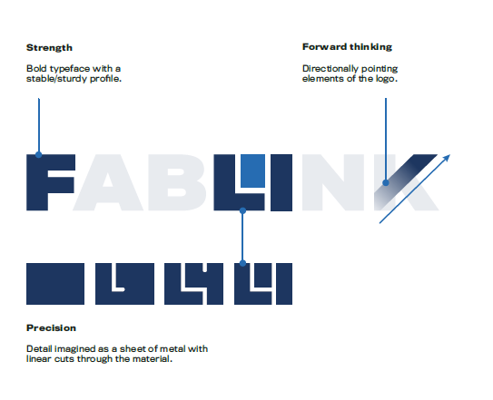
“Once a decision had been made to refresh our branding, we focused on how we could best represent the brand. This proved to be a challenge due to our diverse product portfolio; our business manufactures a range of products, from metal pressings through to heavier products such as cabs and chassis assemblies. It also has to demonstrate a high level of precision, accuracy and control, so it was important to find a way to represent that effectively. Encapsulating these elements equally within a simplified logo took time, but we feel the new design has subtly captured what Fablink represents and we are really pleased with the outcome.”
Commenting on the process, Head of Creative at Bottle, Steve Monk-Chipman, said:
“It was important to keep the Fablink name as the ‘hero’, rather than an icon, to ensure we built on the reputation the brand has already established. To represent the brand’s strength and maturity, we introduced a more sophisticated darker blue colour scheme, with a nod to the brand heritage with the original blue in the smaller square. The square represents a building block, which symbolises the intricacy and precision of linear cuts within metal, acknowledging a large part of Fablink’s business.”
Established in 2005, Fablink has grown substantially over the years, through focused expertise and knowledge, and an ever-expanding process and product portfolio. The new branding will be rolled out over the coming months on all collateral, including the five sites, workwear and sponsorship opportunities.